
Color Palettes: A Modern Guide to Building Beautiful, Wearable Colour Stories
Color palettes have become one of the most powerful tools in modern styling, branding, digital design, and even personal wardrobe building. Whether you’re curating an elegant capsule wardrobe, selecting seasonal shades, or understanding the psychology behind harmonious tones, the right color palettes can completely transform the way you express style. In fashion especially, colour is never accidental — it is strategy, mood, and identity woven into fabric. And that’s precisely why understanding colour harmony is so essential for women today who want their wardrobe to feel cohesive, polished, and deeply personal.
But here’s the secret most people overlook: colour doesn’t need to be complicated. When you understand how palettes work — from monochromatic arrangements to complementary contrasts — every outfit, mood board, or style decision becomes easier and far more intuitive. Whether you’re exploring muted neutrals, striking brights, b&w combinations, or experimenting with new seasonal tones, palettes give your style direction and purpose.
This guide takes you through everything: what palettes are, how they work, how to use them in fashion and design, and how to translate them into real outfits. You’ll also see examples, diagrams, and labelled visuals that make colour theory feel refreshingly modern and wearable.
Table of Contents
- What Color Palettes Really Are
- The Psychology of Colour Selection
- Popular Types of Colour Arrangements
- How to Use Colour Harmonies in Outfits
- From Hex Codes to Wardrobes: Modern Colour Tools
- Building Your Own Custom Palette
- Real-World Examples Across Fashion and Design
- Final Thoughts: Why Color Palettes Still Matter
What Color Palettes Really Are
A colour palette is a curated collection of hues designed to work harmoniously together. It acts as a guide — a framework — used in fashion, design, digital aesthetics, and branding. While the term often appears in creative industries, its influence is very real in everyday wardrobe-building. If you’ve ever wondered why some outfits look effortlessly polished while others feel disconnected, it often comes down to palette cohesion.
Palettes help define tone: calm or bold, warm or cool, earthy or high-contrast. They also answer deeper styling questions like what colours flatter my undertone? or why does this brown feel wrong on me but perfect on someone else? When you choose shades within a defined family, your wardrobe instantly becomes more mix-and-match friendly.
The Psychology Behind Color Palettes Selection
Colour has emotional weight — it communicates long before an outfit does. This is why e-commerce platforms, brand identities, and even fantasy worlds (including DnD character palettes) rely on strategic shade selection.
Warm tones evoke energy, softness, and intimacy. Cool tones create sophistication, calm, and clarity. Neutrals offer grounding, a sense of ease, and timeless elegance. Highlighters, brights, and neons bring immediacy and attention. Understanding this emotional texture makes your colour choices more intentional.
In fashion styling, this plays out beautifully: a muted brown palette can create effortless minimalism; a soft blue gradient feels serene; and a crisp black-and-white pairing delivers instant impact.
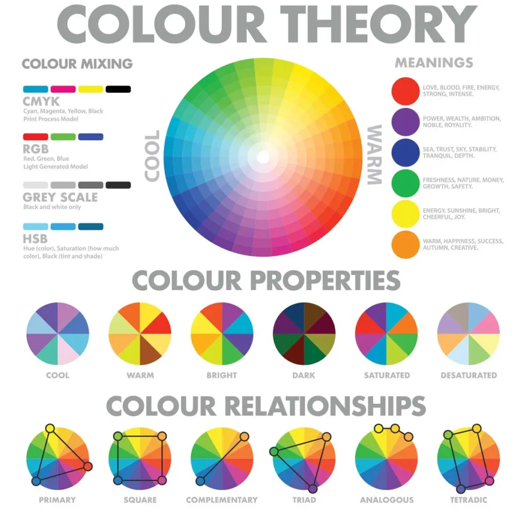
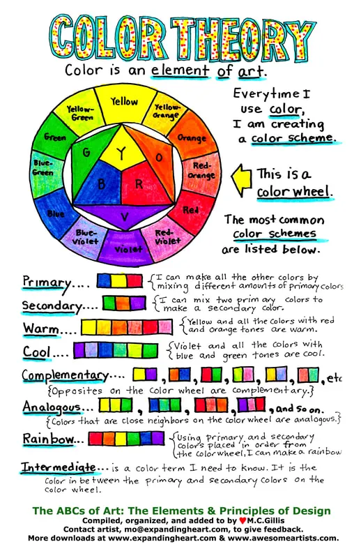
Popular Types of Colour Arrangements
Modern colour systems typically fall into a few core families. Each serves a stylistic purpose and offers unique opportunities for wardrobe-building or creative design.
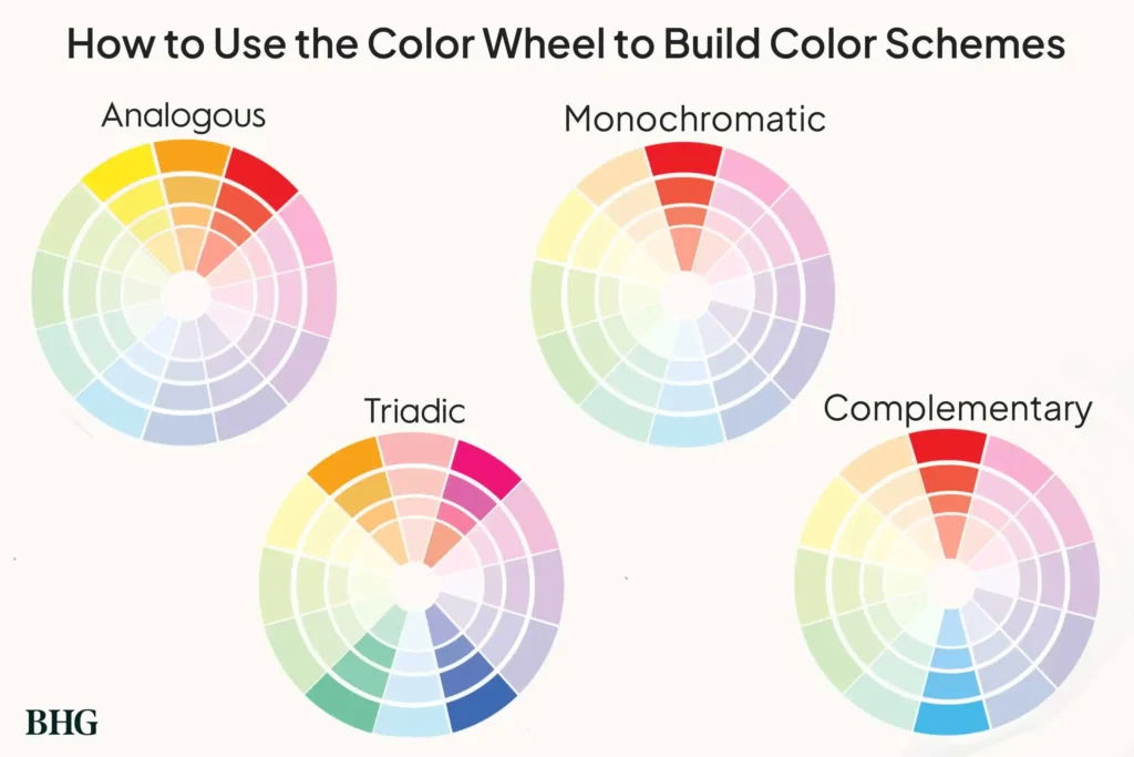
Monochromatic Arrangements
A single hue explored through multiple depths and saturations. Perfect for minimalist dressing and clean aesthetic branding.
Analogous Harmonies
Colours sitting next to each other on the wheel — think olive, moss, and sage. Ideal for autumn styling, earthy stories, or soft transitions.
Complementary Pairings
Shades opposite each other (like blue and orange). High contrast, visually striking, and perfect for statement styling.
Triadic Sets
Three equidistant hues — modern, energetic, and incredibly versatile for fashion-forward looks.
Neutral-Based Color Palettes
Black, white, camel, taupe, cream, charcoal. The foundation of luxury wardrobe styling.
These universal structures apply whether you’re selecting a brown palette colour code for digital use, generating palettes from hex values, or simply deciding what to wear tomorrow.
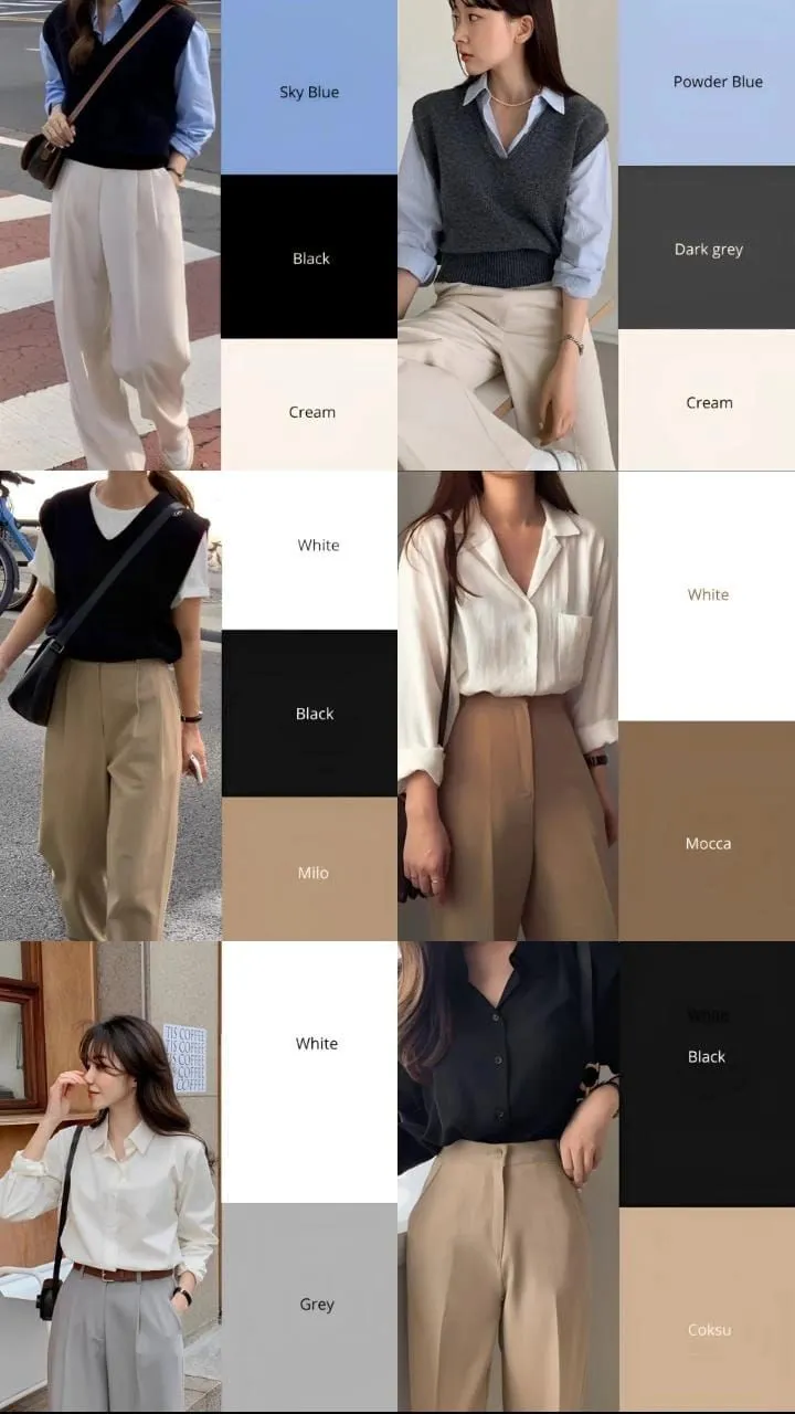
How to Use Colour Harmonies in Outfits
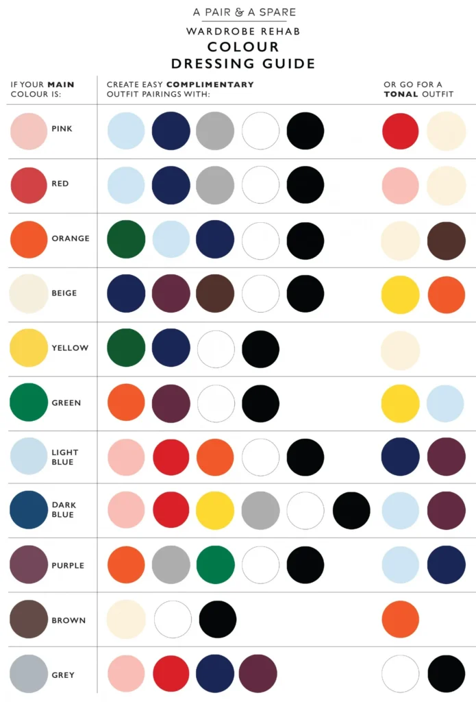
To use palettes effectively, start with intention. Are you building a soft feminine wardrobe? A sharp minimal aesthetic? A bold statement look? Your palette should reflect your style identity.
1. Build Around a Hero Colour
Every palette benefits from a centrepiece hue — your signature shade. It might be navy, camel, burgundy, or beige. Use this dominant tone as your anchor.
2. Add Supporting Neutrals
Cream, ivory, grey, warm taupe, or deep brown keep the wardrobe grounded. Even vibrant dressers need neutrals to maintain versatility.
3. Introduce Accent Color Palettes
Accent tones create interest and seasonal variation. They can be soft pastels, saturated brights, or metallics depending on your aesthetic.
4. Use High Contrast Sparingly
Black and white palettes are incredibly effective but can overwhelm if overused. Keep contrast strategic for maximum impact.
5. Let Texture and Fabric Influence Colour
Velvet deepens a color; silk softens it; wool mutes it. Textiles shift palette perception more than most people realise.
From Hex Codes to Wardrobes: Modern Colour Tools
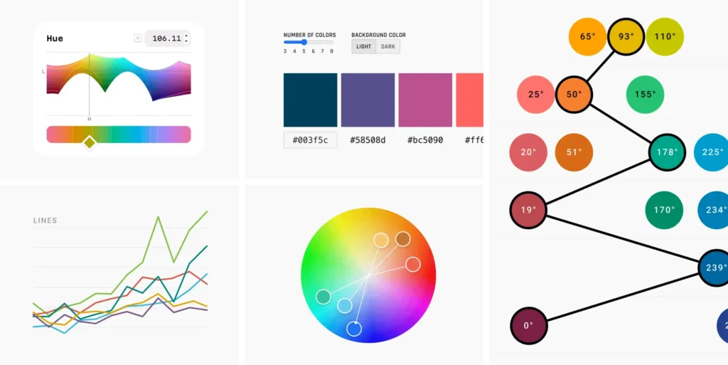
Digital colour discovery is more powerful than ever. Whether exploring b&w combinations, analysing HSB codes, or pulling a palette from a single photo, tools now bridge the gap between design and fashion.
Here’s how they help:
- Hex-code extraction allows you to build palettes from your favourite images.
- Generators (including those used in R, ggplot2, Studio, and Brewer libraries) help designers and stylists visualise harmonious sets instantly.
- E-commerce platforms rely on unified palettes for consistent branding and UX appeal.
- Wardrobe apps use colour harmony to suggest outfits based on your closet’s existing tones.
For styling, this means you can test colour moods digitally before you buy — eliminating waste and impulse purchases.
Building Your Own Custom Color Palettes
A personalised palette is one of the most empowering fashion tools you can create. Here’s an editorial-approved framework to start:
Step 1: Identify Your Core Neutrals
These are your everyday shades — your wardrobe’s backbone. Choose two lights and two darks that flatter your undertone.
Step 2: Choose Two Signature Colours
Pick hues you naturally gravitate toward. Maybe it’s emerald, dusty rose, saffron, or lavender.
Step 3: Add Seasonal Accents
These lift your wardrobe without overwhelming it. Think: summer turquoise, autumn rust, winter plum.
Step 4: Consider Your Lifestyle
Office wear leans neutral; creative roles embrace bold palettes; athleisure favours soft muted tones.
Step 5: Test for Versatility
Each shade should pair with at least four others. If it doesn’t, remove or replace it.
This tailored approach mirrors the techniques used in personal styling and luxury brand development.
Real-World Palette Examples Across Style and Design
Let’s explore a few compelling palette directions inspired by modern women’s fashion, digital aesthetics, and contemporary branding:
Neutral Luxe
Camel, cream, charcoal, soft white
Perfect for capsule wardrobes, H&M neutrals, or high-end minimal styling.
Earthy Browns
Cinnamon, cocoa, bronze, warm beige
Works beautifully with autumn outfits and brown palette colour codes.
Soft Romance
Dusty rose, mauve, blush, soft grey
A favourite for feminine dressers and delicate evening looks.
Black & White High Contrast
Pure black, crisp white, graphite
Timeless, architectural, and instantly striking.
Vivid Highlights
Electric blue, lemon yellow, neon pink
Inspired by highlighter colour hex codes and sporty contemporary design.
Digital Brights
Tech blue, emerald, saturated orange
Perfect for e-commerce brands and modern editorial aesthetics.
Across fashion, gaming (dnd), business branding, and graphic identity, these palettes shape visual stories and provide structure for cohesive, impactful style.
Final Thoughts: Why Color Palettes Still Matter
Colour is more than decoration — it’s direction. The right color palettes carry your style, sharpen your wardrobe, and give your personal aesthetic visual clarity. They help you express identity, mood, and intention, both in fashion and beyond. Whether you’re designing a brand, refining your capsule wardrobe, or experimenting with new seasonal shades, palettes remain a timeless guiding tool.
Mastering them is the secret to styling with confidence — where every outfit feels beautifully considered, effortlessly harmonious, and unmistakably you.
FAQs About Color Palette
1. What exactly is a color palette?
A color palette is a curated group of colours selected to work harmoniously together. It helps guide visual decisions in fashion, branding, interiors, and digital design. In styling, a palette creates cohesion across outfits and ensures your wardrobe feels intentional and expressive.
2. How do color palettes work in fashion?
In fashion, a palette simplifies outfit-building by providing a set of colours that naturally complement each other. This reduces decision fatigue, increases versatility, and ensures your clothing pieces mix and match effortlessly.
3. How many colors should a palette have?
Most functional palettes include 6–12 colours:
- 2–4 core neutrals
- 2–3 signature colours
- 2–3 accent or seasonal colours
This ensures flexibility without feeling overwhelming.
4. What are the main types of color palettes?
Common palette structures include:
- Monochromatic: variations of a single hue
- Analogous: neighbouring colours on the wheel
- Complementary: opposites that create contrast
- Triadic: three evenly spaced hues
- Neutral-based: black, white, beige, taupe, charcoal, cream
5. How do I choose colours that suit my skin tone?
Start by identifying your undertone:
- Warm undertones: golden, peachy, olive skin → best with earthy, warm shades
- Cool undertones: rosy, pink or bluish skin → best with cool blues, purples, jewel tones
- Neutral undertones: balanced → wide range of colours work beautifully